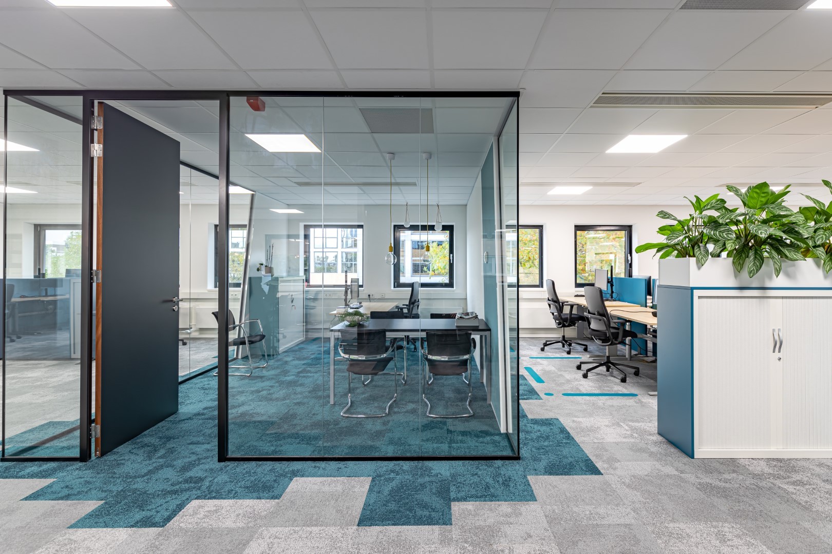
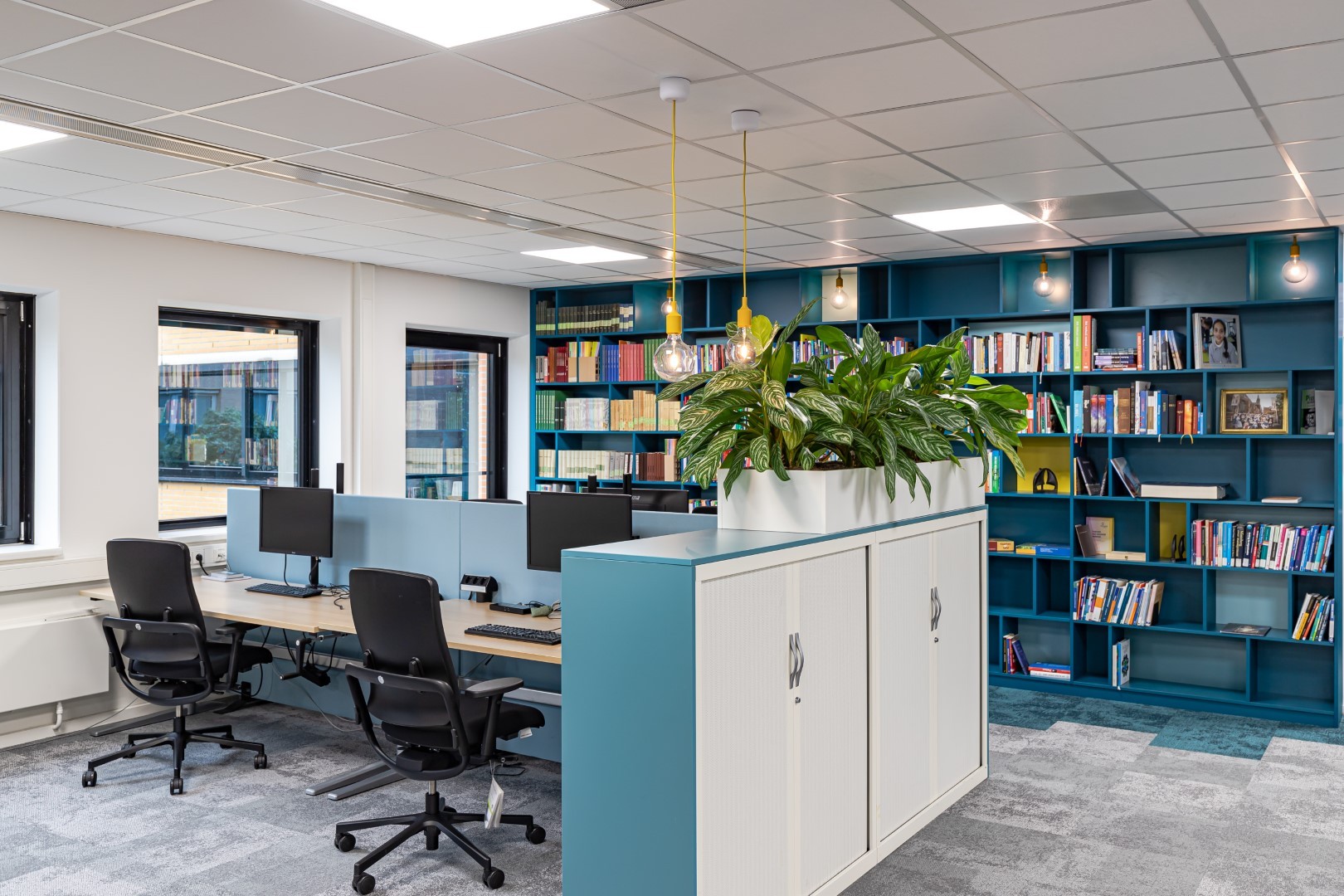
Thanks to the colours petrol sea green and aqua blue everything was given a fresh and tight appearance.
Verus in Woerden is the association for catholic and Christian education in the Netherlands. Over 4,000 schools in primary education, secondary education, intermediate vocational training and higher education are affiliated. When Verus moved to another building in Woerden, they went looking through a tender for a party that could design and furnish the two floors.
Every project has its own challenges. In the case of this large educational association it was primarily a question of using the available space well.
The two floors have an L-shape with a central part in the middle. To accommodate all employees of Verus’ office, we had to solve a puzzle, also because the legal department of Verus turned out to need more closed-off offices than had been initially envisaged.
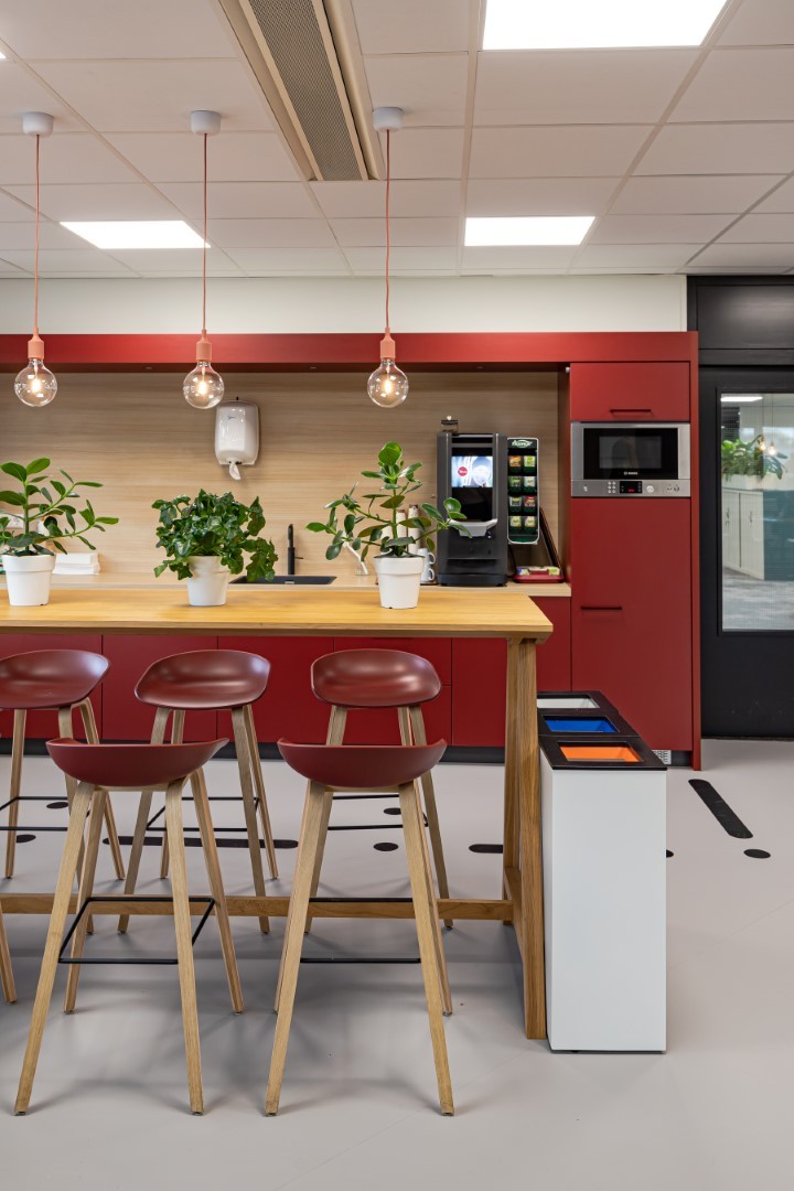
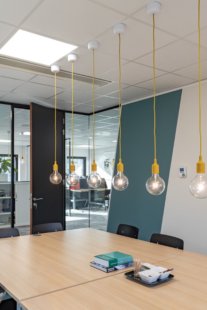
To prevent it from becoming a large, rather dull corridor lined with small rooms, we chose to stagger the glass facades. The diagonal glass parts in the partitions and side walls also created an optical effect that was more playful. Thanks to the colours petrol sea green and aqua blue everything was given a fresh and tight appearance. Verus decided to take along many pieces of furniture that were used at their former location. By refitting them we made everything into a new, matching whole.
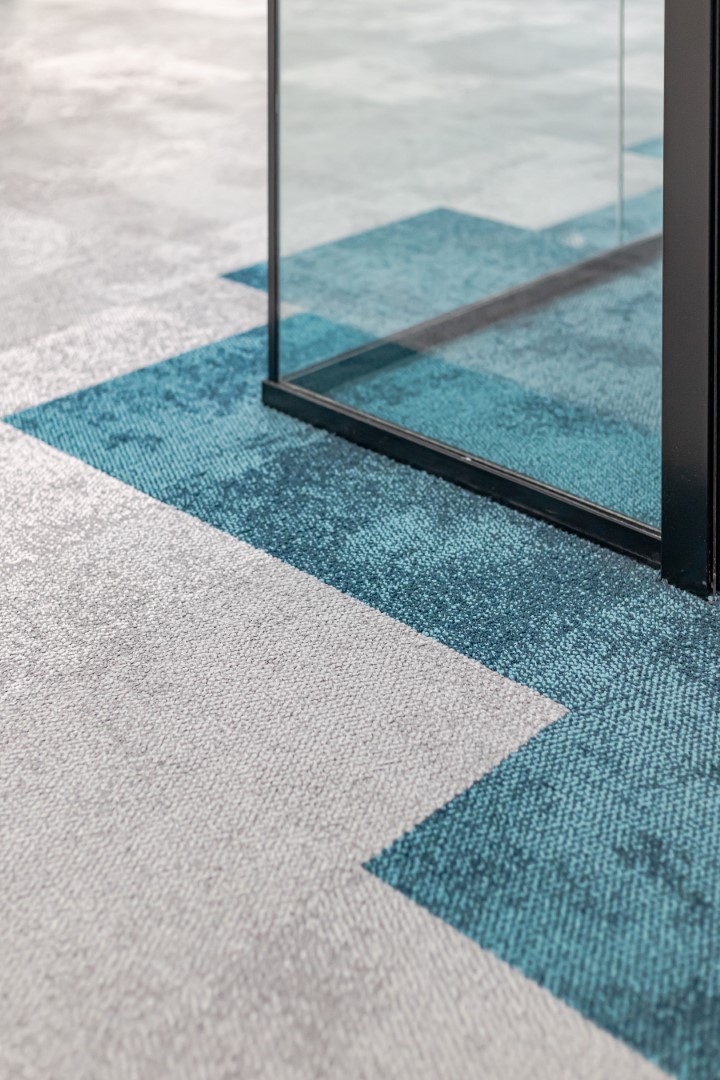
And what to do with the huge amount of books, especially in the legal department? In many workplaces a messy pile of books may be a thorn in the side. But instead of hiding them, we made them into an eyecatcher thanks to a nice, customized bookcase. Talking about books: in a place that works with and for educational institutions a link to a school is an obvious choice. We therefore drew a lineation in the central hall that is reminiscent of a gym floor, so school seems never far away.